Why and when did consumer manufacturers start minimizing instructions provided to customers wanting to use their products? Really, instruction guides have been an afterthought for as long as I can remember, but as the products became smaller, the help guides shrank even more. Am I wrong? Or am I getting less flexible in what I need to know? Many of us gray-haired types will remember when the very first desk top computers became available for everyday users. Even though they had extensive instruction manuals, the writers didn’t do consumer field testing and it resulted in blatant omissions. For example, one of the first manuals for the first personal computer gave lengthy descriptions of the computer parts (display, keyboard, memory, processor, etc.) and then just as lengthy descriptions for using the operating system. Now, remember that this was your first computer and you were being told how to input commands for the first time, but they forgot to tell you to do the most basic function to get the program to run – press the Enter key! In some ways, we haven’t gotten any better because the instructions were written in part by someone who probably is wearing two hats, one for marketing and the other for user-instruction-manual writer.

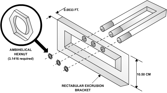
Some graphics help you understand instructions. Others – not so much.
It seems that the instructions are even worse for the coin-cell-battery-sized products. For example, I recently received one of those fitness devices that you clip onto your belt. The instructions were line drawings of the device that were folded up to fit into the device box, measuring about 1 cubic inch. The drawings pointed to buttons and showed the functions for individual and combined presses. They also provided a URL in micro-font-sized characters (without a magnifying glass) so that you could sign-up for a newsletter and if you were lucky, find some more instructions. Every company thinks that its product is intuitive to use and that the instructions are simple to understand – so they don’t need to tell you much to get it to work. I say that you can’t do this for instructions unless you first vet them with people who haven’t used the product, because nothing is easy until you know how.
Another pet peeve is about the products that assume you have an Internet connection, and therefore, they don’t have to provide any printed instructions. When you are trying to use something, a computer/smart phone isn’t the best way to read instructions (especially when the portable device screen goes blank every 30 seconds). Give me paper!
Instructions for products that offer four or more functions are even more challenging and need clearly written directions with tables and line drawings, and probably need video directions to explain nuances. My biggest gripe with these types of products is that they want to impress you with everything that they can do and don’t give you basic information (remember the press the Enter key story?). Recently, I tackled the instruction manual for a mobile video camera (the ones that are 1 x 1 x 0.5-in.) and was frustrated with the lack of simple directions to enable me to use more than one function. It really took several attempts of failing and keeping notes on what I did before I understood the simple instructions. Additionally, it took several tries to figure out how to scroll through the menus. The steps weren’t intuitive and they really needed to tell me that after I finished selecting a video, I needed to press another button to bring me up one level in the menu where I could then select play for that video. Sometimes I think the programmers for these menu trees like to fool the user.
Bottom line: if you want to keep customers, make it easy for them to understand how to use your fantastic product and don’t make assumptions about what they know. I’m sure you, dear readers, have your own horror stories and I would love to hear from you about them. Send it to
Advertisement


