Capacitive touch and OLED: A combination whose use I dread
Welcome to Brian Dipert On Technology: An Electronic Products Ongoing Journey. Hopefully at least some of you recall my name from my 14+ years with EDN Magazine, a career that wrapped up at the end of May and which included (among other things) a six-plus year run of the Brian’s Brain blog. Thanks to the folks here at Hearst Business Communications, I’ll be redirecting a portion of my editorial energy to Electronic Products Magazine going forward.
As those of you who’ve followed my past technology ramblings likely already know, I’m a “work hard, play hard” kind of guy. I live in Truckee, CA, at 7,000 feet above sea level in the midst of the Sierra Nevada Mountains and in the northwest corner of Lake Tahoe, a location that provides abundant year-round outdoor activity opportunities. And, in my fourth winter of living here this past season, I finally figured out how to downhill ski, an enjoyable accomplishment that effectively counterbalanced the drudgery of daily abundant snow shoveling and blowing.
After mastering several of the black diamond runs at Squaw Valley, I decided to further up the challenge ante by tackling the slopes while simultaneously listening to techno music. While most of the world seems to have settled on various flavors of Apple’s iPod hardware (and corresponding iTunes service) as their preferred portable music platform, I’m quite fond of Microsoft’s competing Zune ecosystem, specifically due to its subscription capability which gives me access to millions of tracks’ worth of DRM’d content for less than $15/month (not to mention the 10 DRM-free tracks which are mine to keep each month).
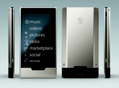
I’ve owned several generations’ worth of Zune-compatible hardware; my latest portable player is a 32GB Zune HD device:

While there’s a lot to like about the Zune HD, both in an absolute sense and versus its various iPod family competitors, my experiences struggling to use it on the ski slopes showcase its sometimes-crippling corresponding shortcomings. As such, I think the Zune HD provides an effective case study in the Achilles Heel of implementing new technology for technology’s sake, versus pausing beforehand to pragmatically ponder if the supposed heir apparent will do any better (or might in fact be worse) than the current status quo.
The Zune HD stacks up feature-wise most closely to Apple’s iPod touch. The long-standing animosity of Steve Jobs, Apple’s mercurial CEO, for excessive user interface buttons is well known to followers of the company and its overarching product design philosophy. As such, the iPod touch contains only four mechanical actuators: a power switch at the top edge, a “home” button at the bottom of the front panel, and up and down volume controls along one side:

Presumably, Microsoft’s engineers thought it would be a good idea to one-up their Apple competitors, because the Zune HD contains only three buttons. ‘Home’ and power are in similar locations to the iPod touch. But instead of physical volume buttons, a third actuator on the side of the device brings up, when pressed, a touch-manipulated virtual control panel on the Zune HD’s display:

This design decision means that pretty much any time you want to accomplish even the most rudimentary of playback tasks (volume up/down, play, pause, fast-forward or rewind, or track skip forward-or-backward), you need to glance down at the Zune HD. For those who, for example, tether a portable music player to their car’s stereo system so that they can audition tunes while driving, the problem is perhaps obvious; you need to temporarily redirect your visual-and-other attention from the road ahead. A similar issue exists while skiing, running, bicycling or engaging in any other activity that you also might want to augment with music playing in your ears; you basically need to stop what you’re doing any time you want to alter the audio playback trajectory or audible intensity.
This annoyance is further amplified by the Zune HD’s touchscreen-augmented OLED display. While it may be crisp and bright in indoors illumination environments, while its lack of need for a dedicated backlight might make the system thinner and more power consumption-stingy than with a LCD alternative, and while its limited operating life might (arguably) be of little concern in the frequently-upgraded and otherwise replaced world of consumer electronics devices, the OLED’s photonic output is washed out to the point of illegibility in direct sunlight or other high ambient illumination environments.
Now factor in the fact that Microsoft decided to dispense with a tried-and-true resistive touch panel in favor of capacitive touch technology, which is essentially unusable when the screen gets wet or with fingers clad in impedance-insulating gloves…both factors common in cold-snow conditions. The bottom line: from a frustration-reduction standpoint, you’d do well to simply resign yourself to hitting ‘play’ when you’re heading up the slopes, then sticking the Zune HD in a dry pocket and leaving it alone for the remainder of the day. Any attempt to use the device while in the midst of activity will likely be ineffective, if not counterproductive.
Marketing is notorious for coming up with ‘well-researched’ feature set requirement conclusions such as ‘the iPod touch has four buttons; our device can have only three (or less)’ and ‘the iPod touch has a LCD display; our device must use an OLED’. Your job as engineer is to appropriately push back, armed with as much hard data as you can assemble, in order to focus the team on competitive differentiators (size, weight, cost-therefore-price, operating life, hardware and software feature set) that potential customers will view as improvements versus setbacks. Otherwise, you’ll inevitably end up with a market ‘flop’ on your hands, a scenario which nobody on the product team wants to have happen.
Brian Dipert
To Comment, visit http://www.eebeat.com/?p=3815
Advertisement
Learn more about Electronic Products Magazine


