Combining multimodal touch and haptic response
Designing mobile handsets for the optimal user experience is not about adding sensor technologies, but how to use their inputs
BY STEVE KINGSLEY-JONES
Immersion, San Jose, CA
www.immersion.com
and ANDREW HSU
Synaptics, Santa Clara, CA
www.synaptics.com
Since their introduction in 2007, mobile handsets with capacitive touchscreens have significantly changed the way users interact with mobile phones. Indeed, the market has embraced these recently introduced devices to such an extent that IDC projects the number of capacitive-touchscreen-based handsets sold will grow to just over 400 million by 2013. This represents 80% of all touchscreen-based handsets (500 million units) and nearly 30% of the forecast 1.46 billion mobile phones.
With so many examples of capacitive-touchscreen phones now on the market, most users, as well as engineers, are quite familiar with the improved user experience these touchscreens offer. In brief, they enable a dynamic, software-controlled user interface (UI) that can be rapidly customized to the many applications that are run on the device. Further, touchscreens can eliminate traditional mechanical buttons, which enables a much larger display without sacrificing compact device size. And capacitive technology is completely solid state, enabling exceptional device durability with minimum optical distortion of the display.
Touch and other sensors
Many touchscreen devices employ additional sensory modalities in an attempt to enhance the touchscreen experience. Most notably, haptics and accelerometer-based motion sensing have already been designed into numerous handsets.
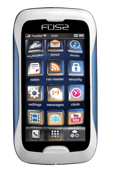
But there is a growing demand by OEMs to differentiate their handsets as well as a desire to fully explore and optimize the design-in experience for next-generation handsets. As such, Synaptics, partnering with Immersion, TheAlloy design group, The Astonishing Tribe (TAT), and Texas Instruments, initiated the Fuse concept handset project (see Fig. 1 ) to create a compelling and functional UI with innovative new modes of sensing input, stunning graphics, and haptic feedback.

Fig. 1. The Fuse concept handset makes novel use of touch and haptic feedback to provide a more engaging user interface.
This article briefly describes the design challenges and solutions associated with implementing the rich touch input subsystem and optimization of the haptic experience, using Fuse as a case study.
Implementation challenges
Although the Fuse handset was based on the TI OMAP 3630 reference design, the hardware was not constrained by any legacy handset platform to better optimize sensory hardware. Some of the advantages of this approach were obvious:
• Reduced latency or sluggishness with integrated sensors and applications.
• Superior multi-modal user experience: things would “feel” like they looked and “act” as expected.
• New more intuitive and superior usage for the customer uncovered.
As it is for most engineering projects, the challenge was to deliver on all of the advantages while integrating several new technologies on a tight deadline. During the project, the main technical touch and haptics challenges encountered included:
• Bus contention from multiple sensors.
• Proper suspension of the system, allowing for the maximum haptic experience.
• Coordination of the UI with multiple channels for input and output.
The dominating issues during the design of the Fuse handset were bus contention and sensor conflict. Given that there are four independent sensors on the device touchscreen, rear touchpad, pressure sensors, and an accelerometer synchronizing when data from each is appropriate and when it is not, is critical in having a functioning UI. The UI and system had to be designed to only make use of the appropriate sensor at any given time.
For example, when dialing a number, the pressure sensors and accelerometer can easily be ignored, but, in theory, a user should have the option of using the front touchscreen or the rear touchpad to enter data. If both are active, the user has to be sure not to touch the wrong one accidentally.
One strategy to address this is to enable both touch areas initially and then, once the user begins to enter data, only monitor the user-selected touch sensor. Another approach is to add significant debounce to each press on the touchscreen and the rear sensor to ensure that an entry is valid.
Haptic effects
In the development of the Fuse handset, the design needed to accommodate a “floating” touchscreen. That is, rather than being rigidly bound to the outer case of the handset, the touchscreen needed a small amount of lateral compliance to allow for crisper and more responsive touchscreen haptic feedback. To overcome any apparent compliance or “mushiness” in the screen, the engineers developed specially designed mounting grommets to provide the lateral support for the touchscreen.
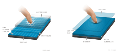
Capacitive sensors suit this type of suspended design as they can be appropriately calibrated to trigger on contact, as compared to resistive touchscreens, which require greater pressure (see Fig. 2 ). This also supports pressure sensors, and multi-stage haptic effect triggering where different haptic effects come into play, depending upon the size or length of the capacitive touch.

Fig. 2. Capacitive-touch sensing technology (left) lends itself more easily to integration with haptic and other sensing than traditional resistive touch sensing (right).
Better accelerometer usage
Another sensor, the accelerometer, is often thought of as a mature sensor already present in many commercially available handsets. However, aside from certain specialty third-party apps, its main usage in today’s devices is to alternate — unreliably, in many cases — between portrait and landscape modes.
In engaging the accelerometer as a central part of the UI, the Fuse team encountered some new roadblocks. As mentioned previously, bus contention was an issue with all the sensors, particularly in those modes where multiple sensors are relevant to the UI. This manifested itself through “jitter” in the UI that was addressed at the software level.
In the Fuse handset UI’s home screen, tilting the device caused the icons to slide up or down the device, and produced a corresponding haptic effect. To prevent this behavior from being sluggish, the accelerometer has a high refresh rate. At the same time, the UI had to be tuned to prevent the slightest tilt from sending icons flying up the screen. On the other hand, for a bouncing-ball game, the responsiveness of the accelerometer makes the experience almost real. This, once again, reaffirms the importance of the UI design to control a complex set of sensors.
Defining the UI
Critical to this project’s success was the UI definitions that the Fuse partners put together. These evolved from the initial concept (proposed by Synaptics and further defined by TheAlloy), through the working UI, to a final solution (all implemented by TAT). The initial guidance ensured that the experience stayed close to the intended definition throughout the development process.
Additionally, the initial plan helped focus the multiple partners toward applying their respective technologies into a cohesive experience instead of a collection of disjointed demonstrations. The lesson from all this was the value of user-centric top-down design, for without a top-down design methodology, it becomes much more difficult to incorporate multiple technologies in a holistic fashion. While multiple sensors can truly enhance the richness of user experience, it is up to the UI to ensure that appropriate sensors are employed at the right times and are coordinated.
The timing of input, visual, and haptic effects is critical to a richer user experience. That is, the contribution of each technology, be it sensing or haptics, needs to be planned as part of a whole, rather than as independent technical features, if a device is to work well. The UI brings this all together to create an optimum experience.
The ongoing need for differentiation in the expanding smart-phone market has many designers searching for innovations in the user experience. With the acceptance of touchscreen-based handsets, a huge opportunity exists to complement the touchscreen interaction with additional sensory input as well as haptic output.
Current handsets already hint at the possible user experience benefits for technologies like haptics. However, the lessons learned from developing the Fuse concept handset show the importance of a top-down planning strategy, especially in coordinating sensory interactions within the overall UI framework. (Further details about the Fuse concept can be found on both Synaptics’ and Immersions’ websites.) ■
Advertisement
Learn more about ImmersionSynaptics


