 The equivalent to virtual fine print, a Dark Pattern is a user interface that has been carefully crafted to trick users into doing things, such as signing up for a recurring payment or surreptitiously releasing your email address for spam though pre-checked forms. Formulated with a solid understanding of human phycology and the interactive nature of the web, savvy companies have begun implementing sophisticated tactics to deliberately confuse and deceive online customers. Here is what you need to know to become aware.
The use of deceptive interfaces: iOS 6
Harry Brignull, a London-based independent user experience (UI) designer with a Ph.D. in cognitive science, founded Dark Patterns intended to “name and shame websites that use deceptive user interfaces.” Ironically, the majority of dark patterns are derived from the same rulebook that web designers and user experience (UX) professionals use to enhance usability.
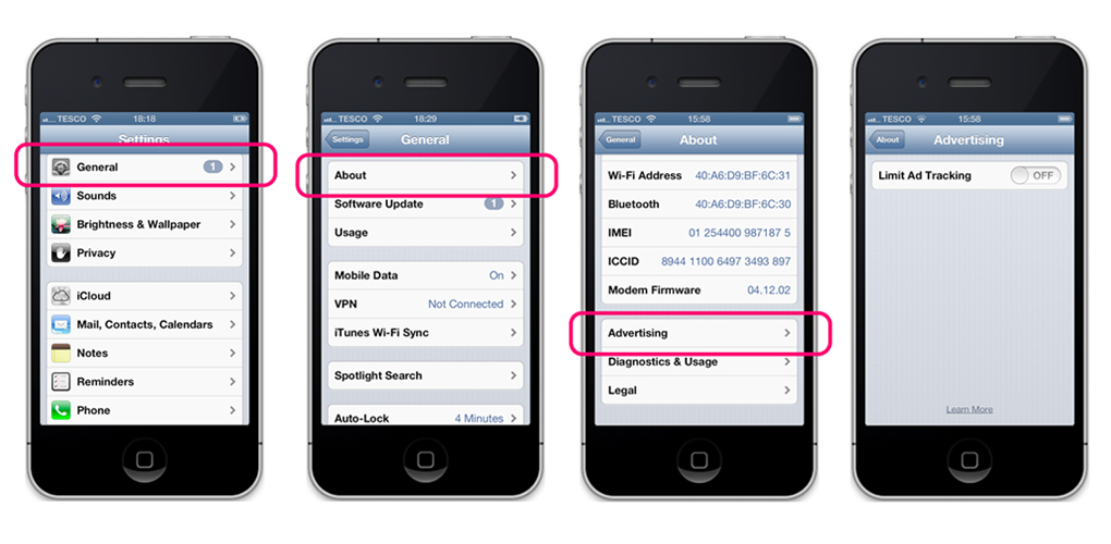
For example, when Apple released iOS 6, one of the features stealthily included by the company was Identifier for Advertisers (IDFA) ad tracking, which allowed information advertisers to track browsing activity to target ads. The tracking is automatically enabled by default, and disabling the feature requires going through several disorienting options in the general settings menu. What’s more, when you finally do reach the advertising menu, the only option in the advertising menu, “Limit Ad Tracking” is automatically selected “Off”. Upon closer inspection the double negative verbiage is troubling; instead of saying “Ad Tracking – Off” it says “Limit Ad Tracking – Off,” meaning it’s not being limited, so when the switch is off, ad tracking is actually on . Off meaning on is a prime example of a dark pattern.  In the example above, three main usability guidelines have been manipulated for use in dark patterns:
1.Visibility of system status: using unclear labels, confusing navigation instead of showing key status information
2.Matching between system and real world: system uses ambiguous and confounded wording, so the text appears to say one thing but actually says another
3.User control and freedom: takes advantage of natural human error to have users accidentally complete actions beneficial to company objective
The allure:
Most dark patterns can be broken down into 14 categories , all intended to trick users into doing something they would not otherwise do. One of the most conniving dark patterns titled Forced Continuity details the common practice of collecting credit card information for a free trial and then automatically bills the user for a paid service without adequate reminder at the end of the trial. Other dark patterns are disguised in the form of 30-page Terms of Service Agreements, which lull users into hitting “agree” on every page, and thus enabling users to be subjected to a myriad of hidden features.
Dark patterns may create short-term benefits for companies, but the deceptive tactics are unlikely to garner a trusting costumer base; so why do companies use them? As the internet continues to expand, companies are turning to quantified numbers to determine success, driven by the metrics of obtaining a large user base.
“The first and easiest trick to have an opt-in is to have a pre-ticked checkbox, but then you can just get rid of that entirely and hide it in the terms of conditions and say that by registering you’re going to be opted into our e-mails,” Brignull said. “Then you have a 100-percent sign-up rate, and you’ve exceeded your goals. I kind of understand why people do it. If you’re only thinking about the numbers, and you’re just trying to juice the stats, then it’s not surprising in the slightest.”
Perhaps one of the most frustrating things about dark patterns is how difficult it is to get companies to make changes. Dark patterns are completely legal and currently operate in a kind of internet safe zone where the trickery is unlikely to be prosecuted.
Fighting dark patterns:
So what can be done? Brignull suggests putting consumer law in place that places an ethical statute on companies, prohibiting the use of unfair or deceptive dark patterns. However, these companies often operate in a legal, safe zone built upon subjective perspective; what might seem fair to a company could be viewed as unethical by consumers. The Federal Trade Commission Act, for example, regulates the use of deceptive online advertising, marketing, and sales, but has no legal authority to regulate companies use of dark patterns, which can often be safeguarded by citing unintentional website design flaws.
With that said, lawsuits can still be effective. JustFab, an online sales service that also owns ShoeDazzle and Fabletics, had to pay a $1.88 million fine to settle allegations of deceptive marketing. Furthermore, the company now posts a total of 14 notifications about its subscription service and requires users to reaffirm their decision to become members twice.
Besides litigation, advocates are also pushing for a technical solution to dark patterns, employing websites to prevent the use of pre-checked boxes and hidden features on the back end.
While there is no clear solution to the dark pattern problem as of yet, raising awareness is the easiest way to safeguard consumers and users from deceptive companies and websites.
Sources: DarkPatterns , Ars Technica , The Verge
Advertisement
Learn more about Electronic Products Digital


