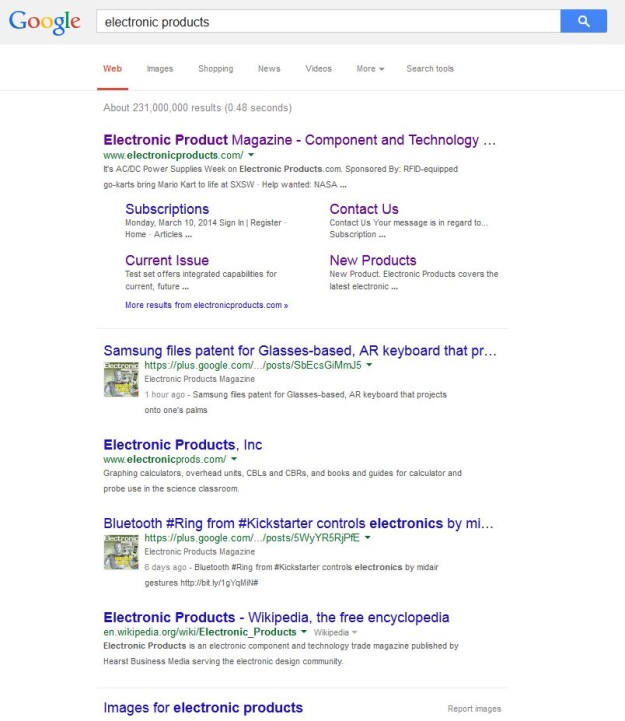
If you’ve googled anything on your desktop computer in the last day or two, then you’ve likely stumbled upon the new look to the web giant’s search result pages.

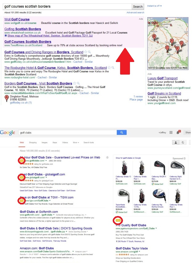
In short, the re-design removes underlines, increases the font size, and to the applause of web users the world over, changes the way ads are labeled in search results.
Specifically, Google has removed the pink shading that previously appeared behind ads; instead, advertisement listings will now be preceded by a small yellow box labeled ad.

These changes are all part of a broader redesign of Google’s result pages, which the company first began rolling out last fall when it started experimenting with the result pages of its mobile users.
“It’s cleaner and simpler, optimized for touch, with results clustered on cards so you can focus on the answers you’re looking for,” Google's senior vice president of search, Amit Singhal, said in a blog post explaining the changes.
It appears that since Google has now rolled out the new look to all of its desktop users, the company is a step closer to creating a more consistent experience for its users across all platforms.
Story via: mashable.com
Advertisement
Learn more about Electronic Products Magazine


